
D3-horizon-chart uses Canvas to draw the horizon charts. This provides great performance even with large amounts of data.

The plugin follows the latest plugin guidelines using D3’s new 4.0 module pattern. AMD, CommonJS, and vanilla environments are supported.

The plugin is heavily inspired by cubism.js, but doesn't make assumptions about real-time metrics and back-end servers.
First, include d3 and d3-horizon-chart on the web page:
<script src="https://d3js.org/d3.v4.js"></script>
<script src="https://unpkg.com/d3-horizon-chart"></script>
To draw a horizon chart use the d3.horizonChart() generator:
var horizonChart = d3.horizonChart()
    .height(80)
    .title('Horizon, 4-band')
    .colors(['#313695', '#4575b4', '#74add1', '#abd9e9', '#fee090', '#fdae61', '#f46d43', '#d73027']);

var horizons = d3.select('body').selectAll('.horizon')
    .data([series])
    .enter().append('div')
    .attr('class', 'horizon')
    .each(horizonChart);
In this case the series variable is an array of random-like data. Here is how the horizon chart looks like:
d3-horizon-chart is available as a standalone library. The Latest builds can be downloaded here:
d3-horizon-chart is also available via npm. You can bundle it with browserify or webpack.
npm install d3-horizon-chart
Then use it:
var dhc = require('d3-horizon-chart')

Horizon Charts are useful, because they preserve resolution.
Here is what happens when you shrink an area chart - as height decreases, there are less and less details:
Horizon Charts instead combine color and position. This allows to preserve resolution, even at small heights.
Horizon Charts increase data density by preserving resolution at smaller heights. This allows to plot more data on less space, providing an effective method to compare multiple data sources in a single view.
Dashboards composed of multiple horizon charts offer good way to analyze patterns over time. Time series data such as stock information or CPU/memory performance across machines are some of the popular usecases.
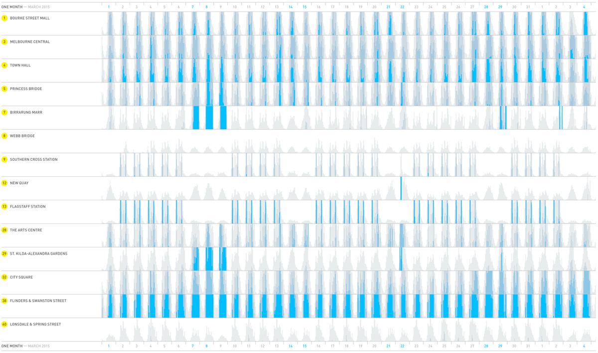
Example illustrating data analysis of pedestrian activity in Melbourne.
The visualization of pedestrian data from March 2015 shows significant spikes accross the city during a 3-day Moomba Festival. Image by Morphocode.
The plugin was developed by Kiril Mandov of Morphocode. The source is available on Github under the MIT License.